10 Product-Led growth PLG principles in action
10 min read
—
Madhukar Kumar
Category
In the last few months, I seem to have developed an obsession with watching YouTube videos.
I LOVE watching all kinds of inspirational videos and TED Talks whenever I can steal a few minutes. Some videos leave you feeling warm and inspired, and you feel like going to your desk and banging out a seminal creative piece yourself.
And then you sit in front of your screen blankly, and nothing comes to mind.
All the beautiful narratives and examples of the most prominent brands and trends by leaders and influencers suddenly seem to disappear into thin air.
Meanwhile, you still have stuff to do. Create documents, research, write code, or other things you do for your job, maybe even make YouTube videos.
This is reality. A reality, where all that grand-sounding fables and advice do not seem to matter anymore.
And this is why it is so special when you are doing something inherently uninspirational — like researching which business software to choose, and you suddenly run into elegant interaction design in a trial experience. This encounter may ever so subtly or significantly influence your purchase decision.
This happened to me recently.
We at DevRev are in the process of building a zero-touch experience based on Product-Led Growth (PLG) principles. As I was going through the trial experience of HubSpot and a few other marketing tech stack providers, I imagined it would be good to capture and share some examples of truly elegant PLG principles currently in practice by some companies. What follows below is my interpretation and opinion based on those trial experiences:
1. All you need is an email address

Three examples of trial pages requiring only an email address to start the experience
Ideally, your users should be able to get started with your product with nothing more than an email address. This seemingly simple principle usually has a remarkable impact on the overall experience. For example, in one of my previous jobs where we created a PLG -based experience, our conversion rate went up to 36% on the sign-up page when we switched to only asking for an email address to get started.
Simply requiring an email address to start a trial doesn’t mean that you will not have other valuable information about your prospective customer. There are some excellent examples like Zendesk and HubSpot (see screenshots below) that allow you to get started with an email address, then they progressively ask for additional information.
In addition, if you are building a PLG-driven experience, consider giving users the extra option to get started with other services they may already be using, like Google or LinkedIn.
2. Free for life
When it comes to offering experiences to prospective customers before purchase, you essentially have two broad categories to choose from:Offer the product as a trial or follow a freemium strategy.
I should mention that some companies follow a hybrid approach which entails providing full access to all functionalities for a limited period and then downgrading users to a free version of the product at the end of the trial.
In the trial category, you typically have a period during which either the entire product or some of the functionalities are free. Then, at the end of the trial, the user decides to either go to a paid version or the access goes away. In some cases, you get to continue to use a minimal set of functionalities.
In the freemium category, you have some functionality that is free for life. This is usually good for a vendor when your primary goal is to build a community, but it singularly fails if your product requires significant hand-holding or training to use.
HubSpot follows a freemium strategy, and this works well because the product is dead simple to use. The interaction design subtly guides you towards more usage and eventually towards paid features, bringing me to my next point.
3. Progressive discoverability
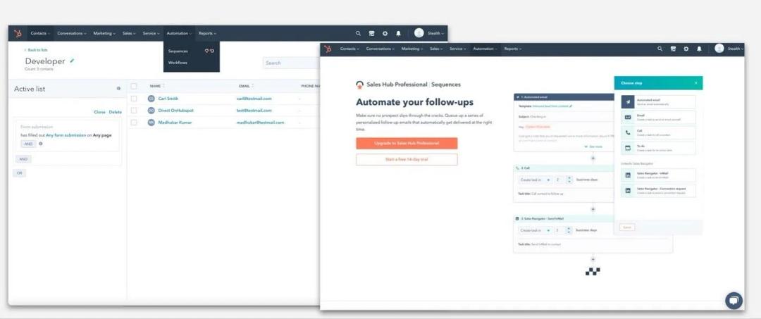
Example of how Hubspot clearly marks premium features in an elegant design
As soon as you sign up with HubSpot, helpful guides nudge you towards completing some specific tasks. When you gradually complete these tasks, you often run into clearly marked “premium” features.
Now, I am willing to bet that the interaction design was probably based on some data that showed how completing specific tasks leads users to “discover” some premium features and thus a higher conversion rate.
This is also a beautiful example of Product Qualified Leads (PQLs), but more of that in a future blog.
4. Do This Then That (DOTT)
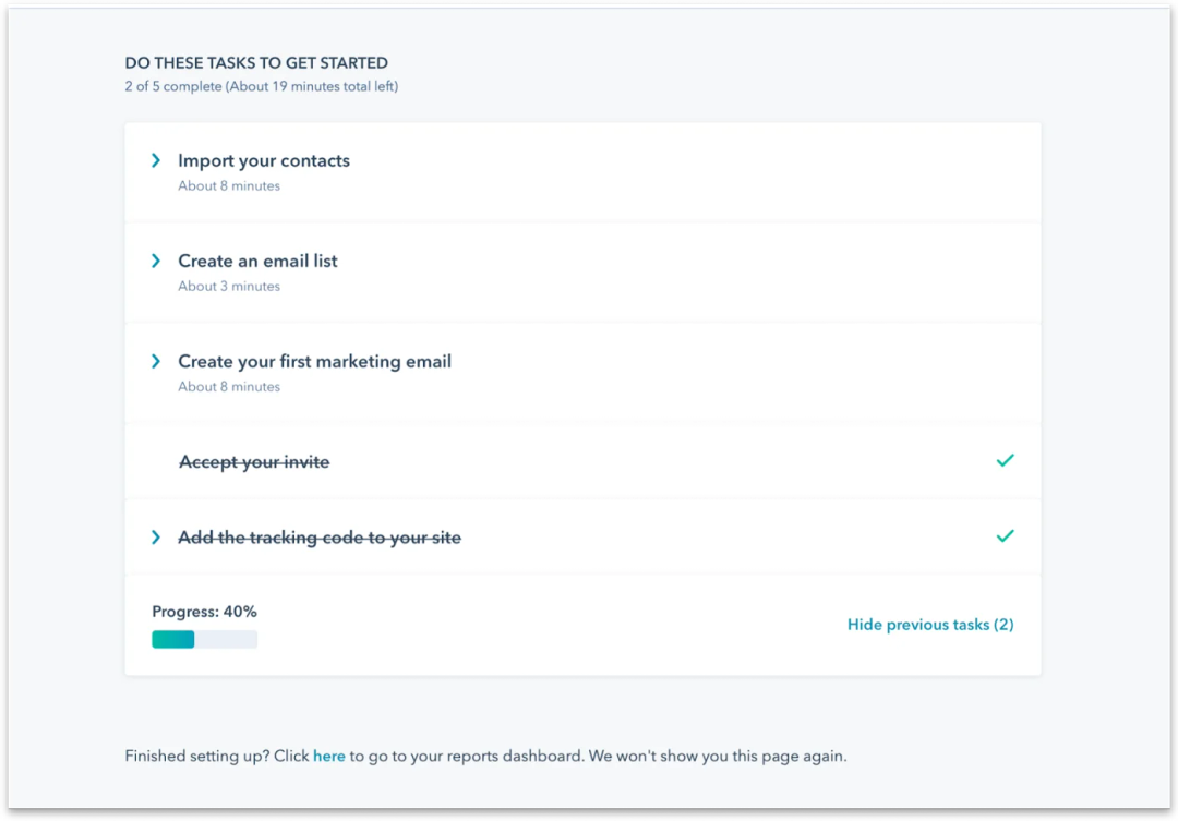
Example of in-app nudges to drive adoption
Product-led experience is typically grounded in the goal of trying to get users to adopt your product as quickly as possible without having them fall off the features fatigue cliff. This phenomenon is quite likely in a zero-touch experience.
This is why easy and engaging onboarding is critical to any trial or freemium experience that helps users discover features by guiding them to complete tasks. Put another way; you want the learnability of the product to be as intuitive and engaging as possible from the get-go.
Tools like WalkMe are excellent for implementing adoption-friendly tasks, and this is another area where the HubSpot trial experience shines. When you first sign in, not only do the guided tours help you discover new features through tasks, there are also helpful visual cues to show how far you are from completing those tasks. The more tasks you complete, the more likely you will use the product and the more likely you are to end up choosing a paid version of the product.
5. Three-click thinking
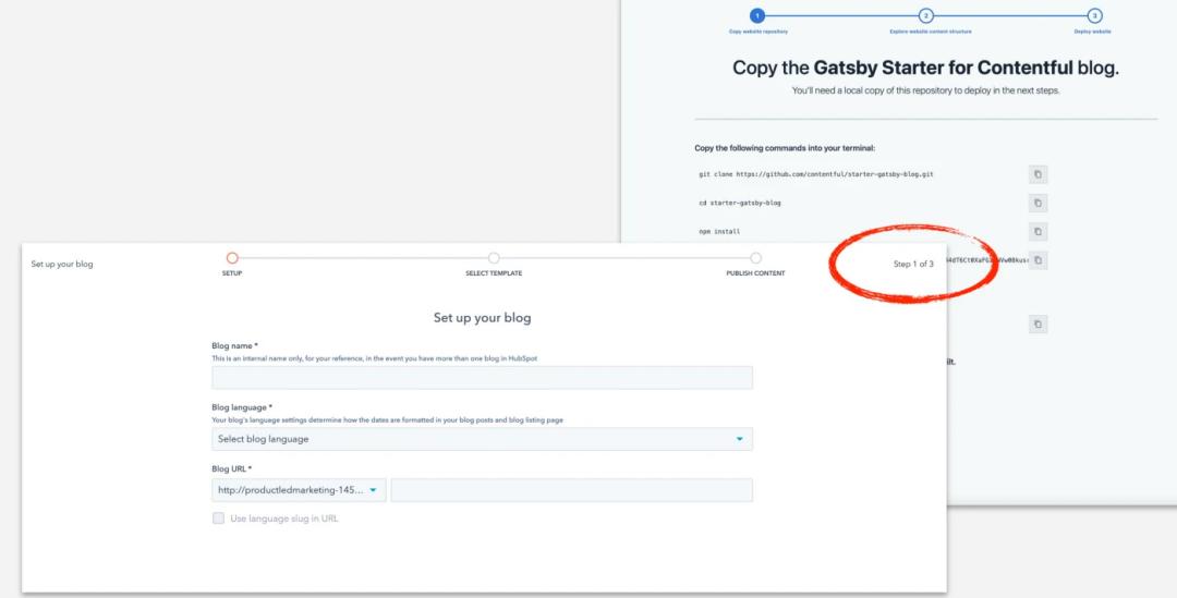
Couple of examples of three-click thinking in trial experiences
One of my favorite design principles for building an elegant PLG experience is three-click thinking. There is something about the magic of threes, especially around completing tasks, that makes things a lot easier.
I see this more commonly across trial experiences these days than I remember coming across a few years ago. When you are building your trial or freemium onboarding experience, think hard about what features are more compelling to demonstrate in the experience. If you can boil it down to three steps, you will gain bonus points from your users, and you will be rewarded with more engagement.
6. The invisible hand of support
There will be segments of your trial users who are either not an avid fan of the guided tours or who are already familiar with your product. They might want to leap over the guardrails and go straight into advanced features. When this happens, and those users run into any issues, you will want to avoid ‘silent failures.’
A silent failure occurs when a user encounters an error or doesn’t understand the intended use of a feature. Instead of getting the right solution for their issue or question, they instead grow frustrated and stop using the product. As a PLG product manager or creator, you are often left scratching your head trying to figure out why users are not adopting your product if silent failures happen a lot. A common symptom of this issue is a high sign-up rate but then a shallow conversion from free to paid users.
To prevent a silent failure, it is critical to have two things as part of your PLG experience: telemetry data about usage and a chatbot backed up preferably by intelligent automation and humans when needed.
Using the HubSpot example again, if you have questions or want to raise your hand to get support, right there on all screens, you have a friendly chatbot that you can invoke to either search for a solution or to have someone call you to hold a human-to-human conversation. You also have the choice of searching answers in the community forum or knowledge base article portal. What’s slick is that the chatbot knows which screen you are on and starts with some helpful links for the screen that you are already on.
7. Reduce the cognitive load
When you are in the business of making software, the users will often inevitably run into inherently complex concepts. To simplify matters, you can rely on making some assumptions on behalf of the users and then allowing them to override those decisions if and when they want.
A good example is when you are looking to import a CSV file into HubSpot. You have to make some choices, like mapping fields, when you upload a file into HubSpot. However, if you decide not to make those choices, the guided tour takes over and tells you that it has made some decisions on your behalf. This still shows the end state of the task, and if you want to override the decision, you can still do so with one click of a button.
8. The user is always in control
When there are choices to make, the users may indeed face a cognitive overload. This doesn’t mean, though, that you should remove all choices to make the experiences simpler. Instead, follow the #6 tenet above to reduce the cognitive load.
However, when you provide choices, it is essential to note that you are sending out the message that you care about all the users, and different users may choose differently. There is more than one way to complete the task, which could be an out-of-the-box experience for some, but provide more guided support for others.
9. Design for the masses, not the power users
In my experience, when you are doing research or reaching out to your end customers to get feedback, the most opinionated users with the loudest voices are typically the power users. IA quick caveat: This is not a sweeping generalization, rather an observation based on my own experience.
Over the years, as a product manager, I often went down the path of listening to the most vocal users and not paying attention to whether that was an edge case for a power user or something of benefit to most users. In hindsight, I feel all trial user experiences should be built for most basic users, not the power users. However, you can provide a gradation of experience in a trial where you can identify and then separate your power users by offering them the choice of self-selecting a deep-dive experience. We did this successfully at one of my previous jobs, where power users could choose some deep-dive topics and self-select into an experience inherently built with non-trivial use cases.
10. Remember and personalize
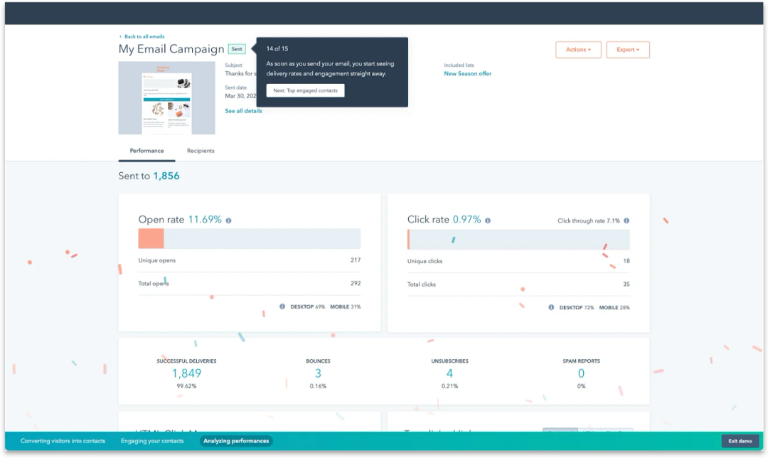
Delighting customers with simple and elegant design
There is nothing more satisfying than jumping into an experience right where you left off the last time. The continuation and “memory” of the system of what you did and what you should do next is a compelling user experience, in my opinion.
There are some outstanding examples of this within HubSpot. When you log back in, the “home” screen shows you where you left off and how far away you are from completing the overall task. This kind of experience makes you feel that the experience is tailored to you personally and demonstrates the company’s empathy for its users.
A lot of work goes into thinking through and building a PLG experience, and I hope describing 10 principles proves helpful for those embarking on a PLG journey.
Please do feel free to reach out to me directly if you have feedback or comments on this article because no one likes a ‘silent failure.’
Related Articles
Patrick van de Werken
Vishal Narendar

Neelabja Adkuloo
Rik Van Bruggen
Computer+ Apps
Our customers
Initiatives
