Turning data dump into data delight with zero clicks and zero code
3 min read
—
Emily Dworkin
Category
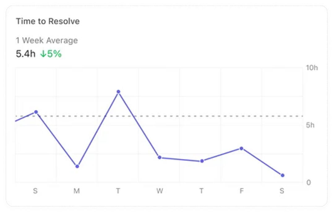
As a user researcher, a data analyst, a data scientist, and a product manager, I’ve found one universal truth: everyone loves a pretty graph. Saying ticket resolution time has decreased 5% w/w doesn’t have the same kind of impact as this:

When initially writing this blog I ran into some writers block and asked ChatGPT to help me out and write a blog about the benefits of data visualization. What it said was mostly true. Data visualization is a powerful tool that allows you to communicate complex information in a clear and concise way. It involves the use of charts, graphs, and other visual aids to present data in a way that is easy to understand and interpret. I agree so far.
Next, is where ChatGPT is looking through rose-colored glasses and glazes over some of the more difficult parts of data analytics and visualization.
- Makes complex data easy to understand The right visualization showing relevant data will make complex data easy to understand. However, ensuring you are providing the most valuable information possible through visualization in a way that is easy to understand across specialties, departments, and levels of experience is challenging.
- Saves time and effort Here’s where I disagree. There’s a reason many visualization tools offer certification courses. To use them well, it requires significant dedicated time and effort to learn the capabilities to create the right visualization for the relevant data. If you’ve never sat in front of a new visualization tool and experienced some level of frustration trying to get what you want out of it…we’re hiring.
- Facilitates better decision making, improves communication 110%…as long as it is the right visualization for the relevant data
Does DevRev have a solution?
We’re working on it! We are launching our first version of in app insights. Our goal is to minimize the amount of time you spend building dashboards so you can maximize the time spent acting on those insights. So, to address these points:
- Make complex data easy to understand We’ve curated a set of visualizations identified from our own experience as well as feedback from our beta partners. We’re actively adding to it so if you have any suggestions or just want to chat metrics with us, use the DevRev PLuG widget icon near the bottom right of your screen to send us a message! I’m personally checking all of these so your voice will be heard.
- Saves time and effort Our goal is to set you up for success immediately with visualizations ready out of the box. There’s no setup, these curated visualizations are already there for you. We are currently working on the ability to customize/filter the data but even as we add features, the goal will always be to minimize your dashboard building time so you can maximize action.
- Facilitates better decision making, improves communication That’s where you come in. We’re launching our v1 based on our experiences and research but we want your feedback to help fuel our v2! What is your definition of success? What metrics are important to your team? How can we help you communicate these to all stakeholders?
See you soon!
Thank you for joining us for this v1, we’re excited to share it with you and continue to v2 and beyond 🚀
Related Articles

Patrick van de Werken

Vishal Narendar

Neelabja Adkuloo

Rik Van Bruggen
Computer+ Apps
Our customers
Initiatives
